Deep Learning Photo Aesthetics - Introduction and Data Analysis
Introduction
Whenever I’m with my girlfriend, travel, or just outside I tend to take a lot of photos. The problem is that a lot of the photos are of the same object just taken from different angles, different lighting, or with completely different framing. This creates the issue of later needing to go back and filter through 20 photos of the same rock in order to trim it down to just one photo that best represents the rock in the moment. The process is tedious, and I know next to nothing about what makes a good photo, thus creating a loop of trying to differentiate between nearly identical photos until I give up and push it off until the next day, then the next day, then the next day, leaving me with hundreds of leftover vacation photos.
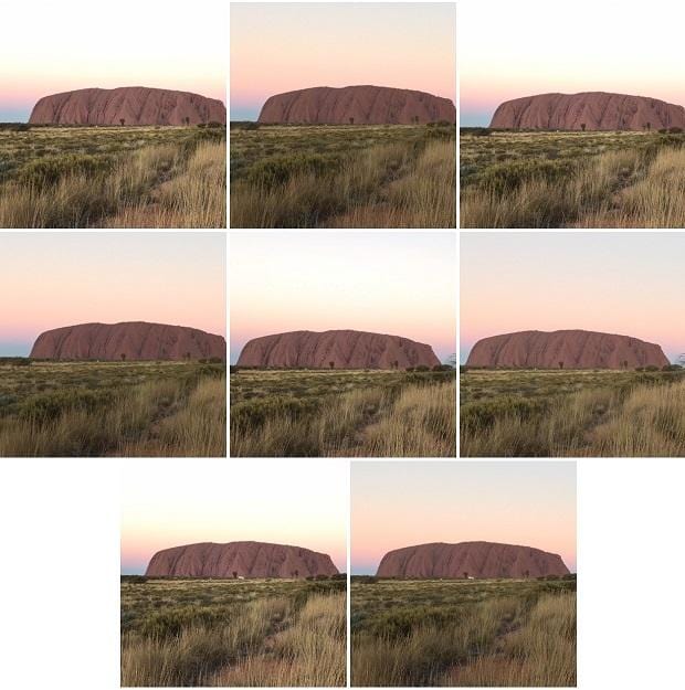
Like most software engineers, I am lazy when it comes to simple tasks, so the plan is to train a neural network to do all the deciding for me, allowing me to finally know which photo of Uluru at sunset is the best. This blog post is going to be the first of many as I document all my successes, and shortcomings, on the path to creating my perfect photo companion.
Research
The first step in any project, especially when dealing with deep learning, is to try and find any previous research in/around the same topic to act as a baseline for the model development. Luckily for me, after a few minutes of Google searching, I found Using Deep Learning to Create Professional-Level Photographs by Google AI, which turned out to be the holy grail of information. Through the article I was able to quickly find a plethora of research papers related to the problem I was trying to solve:
- Creatism: A deep-learning photographer capable of creating professional work
- Photo Aesthetics Ranking Network with Attributes and Content Adaptation
- RAPID: Rating Pictorial Aesthetics using Deep Learning
- AVA: A Large-Scale Database for Aesthetic Visual Analysis
- Comparison of Four Subjective Methods for Image Quality Assessment
- Discovering beautiful attributes for aesthetic image analysis
On the surface it appears that my goal has already been achieved, and all I need to do is simply download the AVA database[4] and mimic an existing model in order to start rating my images.
However, the papers which do propose models also had the means to modify photos by changing color balances in order to create pairs of similar images to feed into the model[1,2], or reduced the problem scope to binary classification[3]. I, working alone, do not have the means to go about creating and rating meaningful color-corrected photos, and I also want my finished product to be more robust than a binary classification of whether the photo is good or bad.
The Problem
Given my limited resources, and not wanting to deal with the predicament of copyrighted data, I will be constrained to the AVA database[4]. A downside to the AVA database is that some of the photos contain text, political messages, or advertisements[4,5,6], which could heavily bias the model towards a specific brand or political affiliation.
Another point of contention within the final model is the inherent bias among the people reviewing the photos. There is a large flaw in a 1-10 scale in that there is no guarantee of relevance or consistency between ratings across the photos, which leads into the tendency of people to vote for the extreme values given the lack of clarity between a 6, 7, or 8 star rating. Furthermore if a photo references pop culture, or tries to incite an emotion like fear or humor, then the reviews may be strongly prejudiced towards the photo’s ability to capture that feeling and not the composition of the photo itself.
Lastly there is the inherent bias among the photographers submitting the photos. Each photographer has their own photographic preference, which could shape what the model perceives as good. Which when combined with the unconscious racial bias built into photography, could leave me with a model that shows racial preference.
The Goal
I will eventually need to come up with a novel model design, but before that I need to fully understand how my data will affect my model. So, when going through the data I will need to be very deliberate in which photos I select and how I preprocess ratings. The rest of this article will be focused on how I analyzed the data, where I’ll be looking for:
- Photos that have a strong chance of introducing text, political, advertisement, pop culture, or emotional bias.
- The distribution of ratings and whether there is significant variance among the photos, or if they all end up pooling around the median of 5/10.
- Determining if there’s a way to ensure consistency of the ratings across the photos, or a subset of the photos.
- Other means to introduce variance and reduce bias within the AVA database.
Data Analysis


The AVA Database is a collection of photos and metadata taken from dpchallenge.com, which is a website that provides weekly photography challenges on specific topics where the community can submit and vote on photos. Each row in the database corresponds to one photo and provides the total number of counts per rating the photo received, two semantic tags, and lastly the challenge the photo was a part of. For example:
| Image ID | 1 | 2 | 3 | 4 | 5 | 6 | 7 | 8 | 9 | 10 | tag_1 | tag_2 | challenge |
|---|---|---|---|---|---|---|---|---|---|---|---|---|---|
| 953889 | 0 | 1 | 0 | 9 | 20 | 40 | 29 | 14 | 11 | 6 | 0 | 0 | 1396 |
| 301674 | 10 | 16 | 41 | 65 | 44 | 21 | 5 | 2 | 0 | 0 | 2 | 10 | 550 |
All of that is fine and good, but going into this I didn’t quite know what that meant. I wanted to fully understand the relationship between the tags and challenges, and build up a mental picture of their associated photos.
When just looking at the normalized distribution of rating counts and the histogram of weighted average across the global dataset in Figure 1 there isn’t much to glean. All that could be inferred was my earlier assumption that a majority of the votes were in fact 5/10. This median-focused distribution may lead to future complications when the model tries to differentiate between median-aesthetic photos and apply a meaningful rating to them.
Investigating Tags
The tags are selected by the photographer on upload and encapsulate various different features like: Nature, Food, Children, Advertisement. With there only being 66 possible tags an uploader can choose from I thought it would be a great first choice to get a feel for the data.
Rating Distributions
First, I wanted to see if the tags could be used as a means to group the images together and be used to give consistency and relevance to an image’s score calculation. To do this I plotted the normalized distribution of ratings per tag , and the weighted average histograms per tag. At first look it seemed that grouping by tags produced essentially the same normalized distribution as the global dataset, just with mild changes to the steepness of the center peak. However, as shown in Figure 2, the average histogram tells another story in that each tag’s average distribution is completely unique, particularly the tags Camera, Maternity, Overlays, and Pinhole/Zone which all have an extreme number of photos weighted near the middle.

Seeing the fact that each tag had a unique histogram of scores gave me confidence in using them to continue my investigation of the dataset.
Tag Breakdown
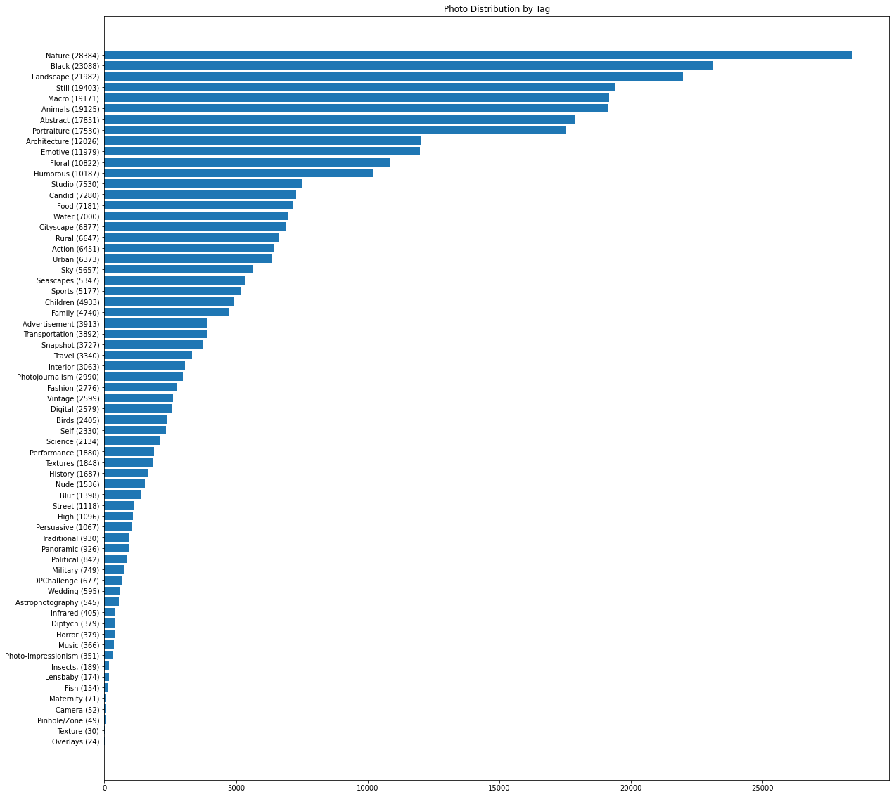
The next step I took was trying to gauge how much of the data each tag represented in order to gain a better sense of what categories the model might bias towards and which may need more data if the final model has issues generalizing. As seen in Figure 3, there is an overabundance of nature, landscape, and animal photos, but a severe lack of wedding and insect pictures. The hope is that the final model will be able to generalize the rules of photography from the abundance of data, making up for the lack of specific categorical representation.
Some of the tags worried me: Advertisement, Horror, Humor, and Political, are all areas of data that I mentioned above as wanting to avoid influencing my model and I’m also unsure as to what some other tags are like Lensbaby or Diptych. On top of that I still haven’t looked at the photos themselves, so I have no idea yet of what a “good” or “bad” photo in the dataset looks like.
Visualization
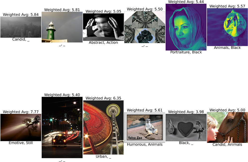
Before relying entirely on tags to classify my data I wanted to visualize a random selection from the data itself. Namely I wanted to get a good sense as to what the average photo looked like, the combinations of tags associated with it, and what the weighted average looked like alongside the photo.
Prior to randomly sampling the images I was working off the assumption that each photo had at least one tag associated with it, however as shown in Figure 4, there are three photos with no tags. Which means that Figure 3 is not an accurate representation of the data, instead Figure 5 shows the corrected breakdown of the tagged photo distribution when taking untagged photos into consideration.
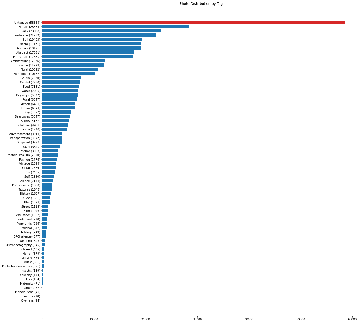
Over ¼ of the data does not contain categorical tags, which means that tags are not a reliable representation of the data. Tags illuminated some potential biases to remove from the final dataset, but won’t be able to provide relevance to individual photo scores, so I pivoted my investigation to the challenges.
Investigating Challenges
As previously discovered not every photo contains a tag, but every photo is uploaded as part of a photography challenge where it is scored against a challenge theme. This means that since each photo is unique to only one challenge its score therefore should be relevant to all the other photos submitted to the challenge. There’s also a high chance for consistency in scoring, assuming that the same people are voting for all the other photos in the challenge.
With tags now out of the equation, I needed to redo all the previous analysis but now on the challenges. I didn’t want to have any assumptions moving forwards without being able to back it up with the data.
Challenge Breakdown


With there being nearly 1400 different challenges I first wanted to know how big of a disparity in the number of submissions there was between the most popular and least popular challenges. The top 70 most popular challenges average about 515 photo submissions, the bottom 70 least popular challenges only average about 45 photo submissions, with the average across the entire dataset being roughly 183 photo submissions per challenge.
This could end up being troublesome in terms of scoring reliability. If challenges with low submissions also have a low number of votes per photo, then those votes simply can’t be trusted as much as a photo with a much higher number of votes. The purpose of utilizing the AVA database is to rely on the dpchallenge community to help naturally guide photos to their “true” score, not have bad photos potentially outrank every other photo in the dataset just because only 7 people voted on it.
Rating Distribution
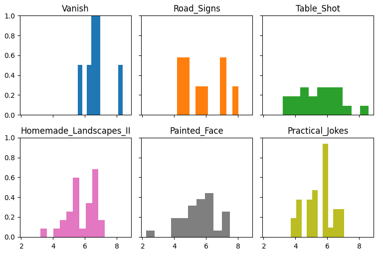
The disparity between challenges is exemplified when comparing the normalized distribution of ratings, and average histograms, of the Top 70 and Bottom 70 challenges. The Top 70 rating distributions and histograms follow the same curve as described in Figure 1. While, as previously predicted, the Bottom 70’s rating distributions are more flat and, as shown in Figure 7, the histograms contain patches instead of being contiguous data.
The non-contiguous data can be explained by the fact that the bottom challenges having so few submissions. Both Vanish and Road_Signs have under 10 photos submitted to the challenge, explaining the abrupt pillars as basically being a single photo’s score. The question then becomes if the ratings on these photos can be trusted when training our model, since there’s not much to compare them with and it seems quite a few of them are weighted towards higher scores.
Voting Averages

On the whole, challenges are able to represent a more refined view into the data, even with the low-contribution challenges potentially having skewed ratings. So long as photos within a challenge receive a large number of votes, which it is assumed more popular challenges will have, then their calculated score will be a more accurate representation of the photo. However, it all relies on how much variance there is between the individual ratings.
Figure 8 shows that an average photo in a popular challenge receives a lot of votes for median ratings, but not so many (if any) votes for the extreme ratings. This can be interpreted as very few photos in large competitions having votes for either of the extreme ratings. Ideally, this means that upon coming across a photo with an extreme rating that the photo’s final score should be weighted more towards that extreme than is currently attributed with the naïve weighted average. This is because if only one photo in a challenge got a 10/10 rating, that photo should be ranked somewhat-significantly higher than any of its competitors so the model recognizes it as a better photo.

After looking at the rating distributions for the most popular challenges, I did the same for the least popular. Oddly enough, even though the challenges themselves had significantly fewer submissions, some of their graphs looked very similar to that of the popular challenges; meaning that my previous assumption of more popular competitions having more votes was completely wrong.


It turns out that the competition with the most photo submissions had an average votes of ~496.16 and a std of ~16.49 across 1108 submissions, however a competition with only 53 submissions had an average of ~450.57 votes and a std of ~8.15. So not only did the lower competition have significantly fewer submissions than the higher one, it still averaged almost the same number of votes per photo! Not only that, it’s smaller standard deviation means that almost all the photos received that many votes, reducing the variance when compared to the challenge with more submissions.
The charts in Figure 10 not only look practically identical but they also average down to almost the exact same mean votes. If you average the mean votes in each section, the popular 70 challenges have an average of ~219 votes, and the unpopular 70 challenges have an average of ~210 votes. Both of which are essentially the same as the mean of all the votes across all the photos in the entire database, which is ~210.
So it doesn’t matter how many submissions a contest gets, but instead how many people voted on average in that contest. Even though Vanish has only 7 submissions I can be more confident in a photo’s final score than a challenge with over 500 submissions, because Vanish averages 262 votes per photo while the other challenge may barely break 100 votes per photo.
Final Thoughts
Although unreliable in categorizing all of the data, tags can still provide insight when preprocessing the data. For instance, certain tags can be occluded from the training dataset during preprocessing to help remove biases.
Challenges are far and above better than tags. They provide a grouping for every photo in the database, where it can be assumed the same people voted across the challenge providing some relevance and consistency to the final ratings. Plus, similarly to tags, certain challenges can be occluded from the training set, which will also help filter out any unwanted untagged photos.
Lastly, as discovered near the end of the challenges investigation the number of submissions to the challenges don’t matter, but instead the average number of votes should be taken into consideration. This allows the following assumptions:
- Dpchallenge has a healthy community that consistently votes across all the challenges, even in challenges that they themselves might not participate in.
- The fact that the largest challenge has an average voting of less than the total number of submissions means that everyone who partakes in a challenge does not vote for every other photo in the challenge. So, the larger the challenge the more likely it is to lose some consistency in ratings.
Now armed with all this knowledge about the limitations of the AVA Database, the next step is to preprocess it into a workable form that meets all my goals.